Friday, March 18, 2016

Pre Work

Surrealism and Photo Montage

Description of Surrealism
"The Surrealist artists sought to channel the unconscious as a means to unlock the power of the imagination. Disdaining rationalism and literary realism, and powerfully influenced by psychoanalysis, the Surrealists believed the rational mind repressed the power of the imagination, weighting it down with taboos."      -theartstory 

Famous Photographers and their Photos
BY: Philippe Halsman-1948


BY: Tommy Ingberg


BY: Joel Robinson


Thursday, March 17, 2016

Project 7

In this photo it is downtown Portland.  I added plaque to describe all the plaques around Portland. I put in the person which is a motion photo to have someone looking down on everything. 

This photo was taken standing in the middle of the street in downtown portland. I took a picture of this man in pioneer square. I kept repeating layers of him to give different colors and different vibes to make him stand out. In the top right side of this image there is a pull with different street names. I added this because it gives the description of Portland, and how many directions you can go.

In this photo I took a panorama on the water front facing downtown. And I added oil to the building to make it looking rainbowish because Portland is a happy place. I then added the mask which gives it the scary look which describes the other side of things.

Tuesday, March 1, 2016

Project 6


Project 6
In this Project we made three different types of photos. The first image is a Cyanotype which has a brush around it to give it crazy edges, it also has a tint of blue which is the reason it is a cyanotype. The next Image is a gum bichromate and with this photo you brush around the image to give it bumpy edges. Also you can give it a texture to give it a different type of background. The third image is a wet plate which is my favorite. In these photos I gave them multiple textures which give it the crazy background and make it look vintage. Also you give the image a tint which gives it the vintage feeling.
Cyanotype
This is a Cyanotype photo. I used a brush around the photo which gave it the crazy edges. Then I made my image Black and White. After making it black and white I gave it a blue tint which makes it a cyanotype. I took this photo by my house on a snowy day.

Gum bichromate
This photo I took during the first project and it was a frame with in a frame until I cropped it. In this photo I gave it a texture and a brush. With my brushes I put 5 different colors which gave me this kind of pinkish reddish color. The brush also gave me this kinda gritty bumpy border. I sharpened this image to make the lines stand out on the pot.

Wet Plate Collodian
This image was taken downtown on a cloudy day. I gave it two different textures which gave it this vintage look. I brought down the opacity so that the textures did not over power the photo. I made this image Black and White and then gave it a bronzy tint which is why it looks like an older image.

Wet Plate Collodian
In this image I gave it two textures, one with a border and one of cement.  I really like this photo because it reminds me of a old film where the image is blury. I gave this a gaussian Blur and made the image black and white. After making it black and white I gave it an orange tint. I then kept the opacity high so that the image stays dark. 

Friday, February 26, 2016

Prework


Gum Bichromate
Photographer: Marc San Valentin
Gum Bichromate photos are light sensitive. In this photo you need two types of mixers to complete it. This photo needs to be in a Dark room to process. The inventor is Mungo Ponton in the early 1800's. For more detail click here.
Brush
Here is my Brush and I made this by adding a bunch of different brushes. I liked this cause it looks like a face and shows the different feelings in the background because the colors.

Cyanotype
Photographer: Anna Atkins
A cyanotype photo was invented in the mid-1800's by John Herschel. A cyanotype photo has a shade of blue. To make these photos two chemicals are needed. For more detail to create this image click here.

Wet Plate Collodion
Photographer: Borut Peterlin
A Wet Plate Collodion print is a photo process from the mid-1800's.  The inventors of this process are Frederick Scott Archer and Gustave Le Gray.  In this process you make the photo wet with two chemicals. Then you let it dry for about 15-20 minutes. This needs to take place in a darkroom. Link here for more detail


Tuesday, February 16, 2016

Project 5

HDR
In this HDR image I merged five photos together. Then I added a preset which brought out the Blues. Then at the end I added a motion blur which made the photo blury 
HDR
In this image I was standing in the middle of the street and put my phone up a little and took this image. Then I merged five photos and added a preset to make the clouds stand out.
HDR
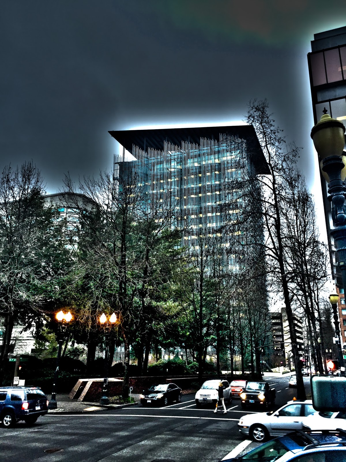
In this image I was standing on the corner of a street. When editing, I darkened the image but then I sharpened the photo all the way to make the building stand out more.
HDR
This image is an a Panorama edited to be an HDR. I was standing on the water front and turned around and took a photo of all the large buildings. I really like the white around the top of the buildings.
Motion Exposure
In this Image I took numerous photos of a couple boats at different angels. Then I merged them all together and lowered the opacity. Then I darkened the image.
Motion Exposure
In this photo I had him stand still and I walked around him taking different images from different angles.
Motion Exposure
In this image I walked around a pilar while laying on the ground to get different angles.
Panorama
In this image I took 7 different photos of the water fountains and then merged them together. Then I made the image black and white.

Panorama
In this image I took numerous images of the keller auditorium and then added a preset to make it pop out and be more white. 


Tuesday, December 8, 2015

Project 3 Balance and Contrast

This is my blue flower kaleidoscope and I liked this photo because the blues all lined up with each other and I also tried to darken the edges to make the blues stand out.

This is my red orange leaf kaleidoscope and it somewhat looks like an hourglass. It also looks like birds wings. In this photo I darkened the edges but took away the roundness.


This is my orange leaf kaleidoscope I brought four photos together and
ended up making a face which I felt was really cool. I also made it circular.

This is my rose kaleidoscope and I darkened the edges but than
reduced it to make it look as if it is getting from dark to light.

In this diptych I had him squat down on the stair way and
turned my shutter speed to two seconds to show the motion and
in the next photo I had him jump. 

In this diptych I had him shake his had side to side and in
the second image I had him move his hands up and down
I also used a type of black and white preset for the edit.

In this diptych I made it a lighter black and white to
almost make him disappear I the second photo. In
the first image he is standing still and in the second image he is
walking and my shutter speed is at 2.

This is a triptych photo and first was a normal photo of him sitting
and then next he was getting up from his seat and third he was walking
into his classroom. The motion photos were taken with a shutter of 2.

This is my triptych and I used a preset black and white to make her almost
disappear in the third image. In the first image she is flapping her
 arms, in the second she is walking and in the third she jumps.

This is my radial balance and in this photo I
brought out the saturation in all the the different colors
to make them stand out and darkened around them.

This is my contrast in texture and this image I brought out the contrast all the way and I also brought up the clarity all the way to see the texture. Also when editing I raised the oranges and took down the yellows.