Tuesday, February 16, 2016

Project 5

HDR
In this HDR image I merged five photos together. Then I added a preset which brought out the Blues. Then at the end I added a motion blur which made the photo blury 
HDR
In this image I was standing in the middle of the street and put my phone up a little and took this image. Then I merged five photos and added a preset to make the clouds stand out.
HDR
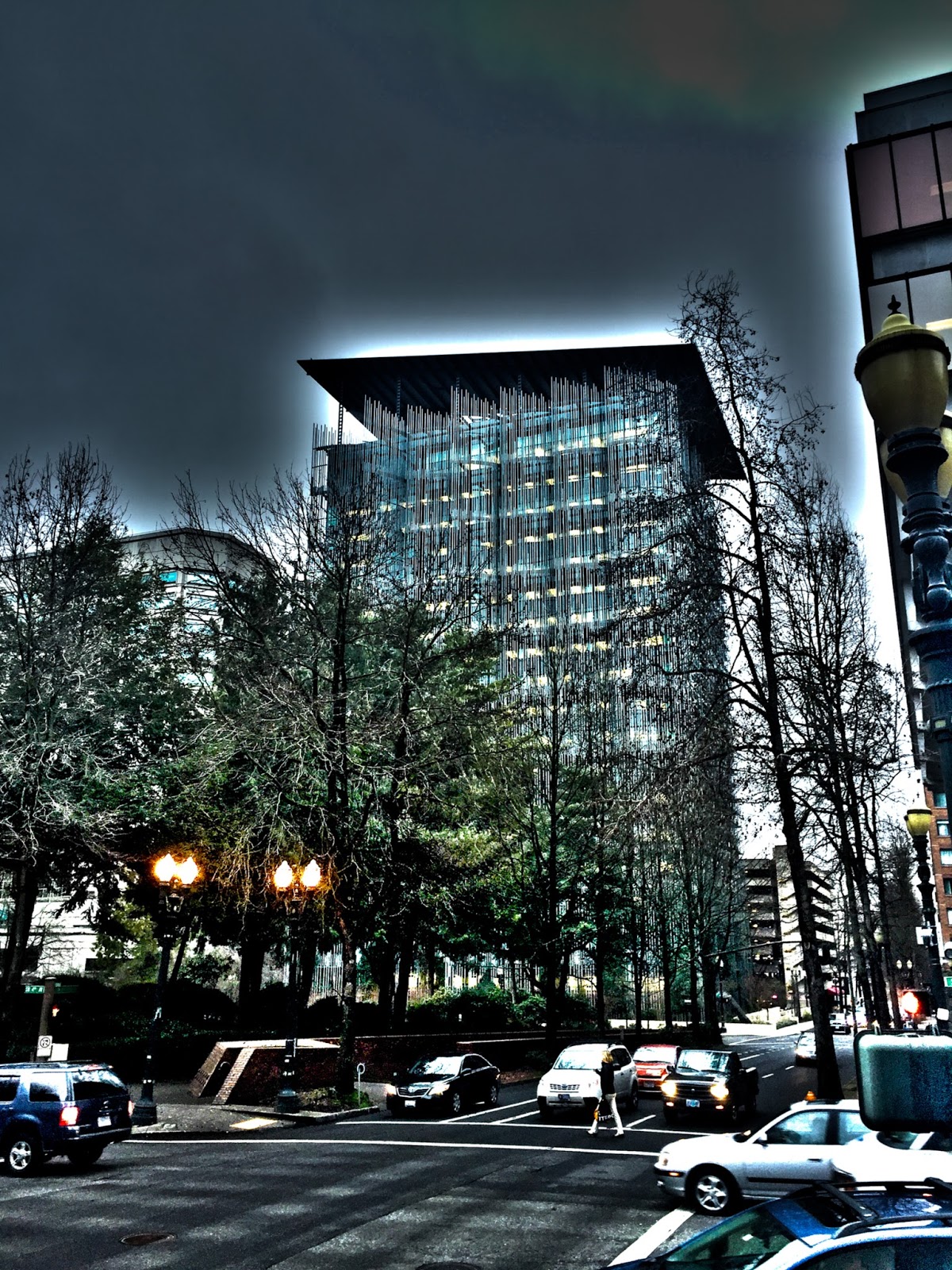
In this image I was standing on the corner of a street. When editing, I darkened the image but then I sharpened the photo all the way to make the building stand out more.
HDR
This image is an a Panorama edited to be an HDR. I was standing on the water front and turned around and took a photo of all the large buildings. I really like the white around the top of the buildings.
Motion Exposure
In this Image I took numerous photos of a couple boats at different angels. Then I merged them all together and lowered the opacity. Then I darkened the image.
Motion Exposure
In this photo I had him stand still and I walked around him taking different images from different angles.
Motion Exposure
In this image I walked around a pilar while laying on the ground to get different angles.
Panorama
In this image I took 7 different photos of the water fountains and then merged them together. Then I made the image black and white.

Panorama
In this image I took numerous images of the keller auditorium and then added a preset to make it pop out and be more white. 


Tuesday, December 8, 2015

Project 3 Balance and Contrast

This is my blue flower kaleidoscope and I liked this photo because the blues all lined up with each other and I also tried to darken the edges to make the blues stand out.

This is my red orange leaf kaleidoscope and it somewhat looks like an hourglass. It also looks like birds wings. In this photo I darkened the edges but took away the roundness.


This is my orange leaf kaleidoscope I brought four photos together and
ended up making a face which I felt was really cool. I also made it circular.

This is my rose kaleidoscope and I darkened the edges but than
reduced it to make it look as if it is getting from dark to light.

In this diptych I had him squat down on the stair way and
turned my shutter speed to two seconds to show the motion and
in the next photo I had him jump. 

In this diptych I had him shake his had side to side and in
the second image I had him move his hands up and down
I also used a type of black and white preset for the edit.

In this diptych I made it a lighter black and white to
almost make him disappear I the second photo. In
the first image he is standing still and in the second image he is
walking and my shutter speed is at 2.

This is a triptych photo and first was a normal photo of him sitting
and then next he was getting up from his seat and third he was walking
into his classroom. The motion photos were taken with a shutter of 2.

This is my triptych and I used a preset black and white to make her almost
disappear in the third image. In the first image she is flapping her
 arms, in the second she is walking and in the third she jumps.

This is my radial balance and in this photo I
brought out the saturation in all the the different colors
to make them stand out and darkened around them.

This is my contrast in texture and this image I brought out the contrast all the way and I also brought up the clarity all the way to see the texture. Also when editing I raised the oranges and took down the yellows.


Tuesday, November 24, 2015

Contrast in scale

Mathew People
Symmetrically Balanced 
Kathy Wylie
Radial Balance

Russ Burden
Contrast in scale

Joaquin Duenas
Contrast in color and value
Ron Bigelow
Contrast in texture

Sunday, November 8, 2015

Mood photo

This photo is my Mood photo. I edited this photo a lot by bringing up the contrast and also the saturation extremely high. By doing so it brought out all the colors a lot and really brought out the greens. The original to this photo is very bland but the edit makes this photo a very colorful attractive eye catching image.

Grids Project

 In this project I took many colorful photos and then edited to go along with a color wheel. With these colorful photos I put them in grids with colors that went along with colors shown on the color wheel and also photos that are the complete opposite. By putting the colors together it created mood, cool, warm, monochrome, and complimentary photos.


Complementary Grid


Cool Grid


 Monochrome Grid


Monochrome


Purple Grid


Warm Grid


Mood Photo by Frank Leblanc


This is a monochrome mood photo by Frank Leblanc and it is monochrome because it is all the same color. I believe he edited to all be the same color and show darkness with cooler type colors or shades.