Monday, May 30, 2016
Stop Animation Final
This is our Final project, and it is a Stop Animation video. In this we made it a utopia happier feeling at the beginning of the film, and then at the end we gave it a dystopia feeling. Stop Animation is hundreds of photos rapidly playing which makes it look like a video.
Friday, May 20, 2016
Monday, May 16, 2016
Pre work Utopia-Dystopia
 |
| Photographer: Matthew Cremer Utopia Utopia Definition: An imagined place or state of things in which everything is perfect. |
 |
| Photographer: Chris Dessaigne Dystopia Dystopia Definition: An imagined place or state in which everything is unpleasant or bad, typically a totalitarian or environmentally degraded one. |
Friday, May 6, 2016
Thursday, April 7, 2016
Project 8
 |
| Fien Art Portrait In this image I had him put on his hood to give off mood. I gave the image a black and white preset, and a vintage look to give off a older look to the image. |
project 8 pre work
 |
| Deborah Pendell- Fine Art photography I love how this photo is Black and White, and how the background is plane to focus on the boy. I also love the mood this image gives off, it shows real emotion. |
 |
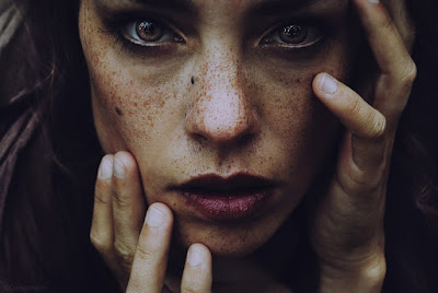
| Cristina Hoch-Fine Art Portrait I Like this photo because how the editing was done, it made her eyes and freckles stand out, and really shows the definition of her face and her facial structure. |
 |
| Scott Redinger-Commercial Portrait In this photo they are advertising the hospital and a doctor. I like this because how clean it is and really gets the advertisement across. |
 |
| Tim Coburn- Commercial Portrait In this photo it is advertising boxing gloves. I like the black and white and how it shows the definition of his muscles and the mood it gives off. |
Friday, March 18, 2016
Pre Work
Surrealism and Photo Montage
Description of Surrealism
"The Surrealist artists sought to channel the unconscious as a means to unlock the power of the imagination. Disdaining rationalism and literary realism, and powerfully influenced by psychoanalysis, the Surrealists believed the rational mind repressed the power of the imagination, weighting it down with taboos." -theartstory
Famous Photographers and their Photos
 |
| BY: Philippe Halsman-1948 |
 |
| BY: Tommy Ingberg |
 |
| BY: Joel Robinson |
Thursday, March 17, 2016
Project 7
 |
| In this photo it is downtown Portland. I added plaque to describe all the plaques around Portland. I put in the person which is a motion photo to have someone looking down on everything. |
Tuesday, March 1, 2016
Project 6
Friday, February 26, 2016
Prework
 |
Gum Bichromate Photographer: Marc San Valentin Gum Bichromate photos are light sensitive. In this photo you need two types of mixers to complete it. This photo needs to be in a Dark room to process. The inventor is Mungo Ponton in the early 1800's. For more detail click here. |
 |
| Brush Here is my Brush and I made this by adding a bunch of different brushes. I liked this cause it looks like a face and shows the different feelings in the background because the colors. |
| Cyanotype Photographer: Anna Atkins A cyanotype photo was invented in the mid-1800's by John Herschel. A cyanotype photo has a shade of blue. To make these photos two chemicals are needed. For more detail to create this image click here. |
 |
Photographer: Borut Peterlin A Wet Plate Collodion print is a photo process from the mid-1800's. The inventors of this process are Frederick Scott Archer and Gustave Le Gray. In this process you make the photo wet with two chemicals. Then you let it dry for about 15-20 minutes. This needs to take place in a darkroom. Link here for more detail |
Tuesday, February 16, 2016
Project 5
 |
| HDR In this HDR image I merged five photos together. Then I added a preset which brought out the Blues. Then at the end I added a motion blur which made the photo blury |
 |
| HDR In this image I was standing in the middle of the street and put my phone up a little and took this image. Then I merged five photos and added a preset to make the clouds stand out. |
 |
| HDR In this image I was standing on the corner of a street. When editing, I darkened the image but then I sharpened the photo all the way to make the building stand out more. |
 |
| Motion Exposure In this Image I took numerous photos of a couple boats at different angels. Then I merged them all together and lowered the opacity. Then I darkened the image. |
 |
| Motion Exposure In this photo I had him stand still and I walked around him taking different images from different angles. |
 |
| Motion Exposure In this image I walked around a pilar while laying on the ground to get different angles. |
 |
| Panorama In this image I took 7 different photos of the water fountains and then merged them together. Then I made the image black and white. |
 |
| Panorama In this image I took numerous images of the keller auditorium and then added a preset to make it pop out and be more white. |
Tuesday, January 19, 2016
Subscribe to:
Comments (Atom)


