Tuesday, December 8, 2015

Project 3 Balance and Contrast

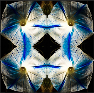
This is my blue flower kaleidoscope and I liked this photo because the blues all lined up with each other and I also tried to darken the edges to make the blues stand out.

This is my red orange leaf kaleidoscope and it somewhat looks like an hourglass. It also looks like birds wings. In this photo I darkened the edges but took away the roundness.


This is my orange leaf kaleidoscope I brought four photos together and
ended up making a face which I felt was really cool. I also made it circular.

This is my rose kaleidoscope and I darkened the edges but than
reduced it to make it look as if it is getting from dark to light.

In this diptych I had him squat down on the stair way and
turned my shutter speed to two seconds to show the motion and
in the next photo I had him jump. 

In this diptych I had him shake his had side to side and in
the second image I had him move his hands up and down
I also used a type of black and white preset for the edit.

In this diptych I made it a lighter black and white to
almost make him disappear I the second photo. In
the first image he is standing still and in the second image he is
walking and my shutter speed is at 2.

This is a triptych photo and first was a normal photo of him sitting
and then next he was getting up from his seat and third he was walking
into his classroom. The motion photos were taken with a shutter of 2.

This is my triptych and I used a preset black and white to make her almost
disappear in the third image. In the first image she is flapping her
 arms, in the second she is walking and in the third she jumps.

This is my radial balance and in this photo I
brought out the saturation in all the the different colors
to make them stand out and darkened around them.

This is my contrast in texture and this image I brought out the contrast all the way and I also brought up the clarity all the way to see the texture. Also when editing I raised the oranges and took down the yellows.


Tuesday, November 24, 2015

Contrast in scale

Mathew People
Symmetrically Balanced 
Kathy Wylie
Radial Balance

Russ Burden
Contrast in scale

Joaquin Duenas
Contrast in color and value
Ron Bigelow
Contrast in texture

Sunday, November 8, 2015

Mood photo

This photo is my Mood photo. I edited this photo a lot by bringing up the contrast and also the saturation extremely high. By doing so it brought out all the colors a lot and really brought out the greens. The original to this photo is very bland but the edit makes this photo a very colorful attractive eye catching image.

Grids Project

 In this project I took many colorful photos and then edited to go along with a color wheel. With these colorful photos I put them in grids with colors that went along with colors shown on the color wheel and also photos that are the complete opposite. By putting the colors together it created mood, cool, warm, monochrome, and complimentary photos.


Complementary Grid


Cool Grid


 Monochrome Grid


Monochrome


Purple Grid


Warm Grid


Mood Photo by Frank Leblanc


This is a monochrome mood photo by Frank Leblanc and it is monochrome because it is all the same color. I believe he edited to all be the same color and show darkness with cooler type colors or shades.

Monday, October 12, 2015

Framing and Composition Assignment

Close Up Original

Close Up (edit)- I Edited this by changing it from pink to purple, I brought out the greens, especially in the middle of the flower. I took this photo by getting close to the flower and putting the camera directly in front of the plant.

Rule of Thirds Original


Rule of Thirds(edit)- I took this photo in a plant shop and I moved the skeleton over. Also I edited this photo to make the skeleton look less white and new as well as making the plant look a very dark green. 

Leading Lines (original)
Leading Lines(edit)- I took this photo by bending down in the middle of the road so I would be on top of the lines. Then I angled my camera up a little and took the photo. I edited this photo for the lines to be a very bright yellow and the blue sky to look exotic and purple.
Filling in the Frame Original
Filling in the Frame (Edit)- I cropped the photo by removing most of the bottom of the photo. I laid on the ground to get level with the brick wall at a better angle. In this photo I have very high clarity and very high contrast.


Close up (edit)- In this photo the original was very light and bland. I darkened around the design and then made the red really stand out. I also brought down the clarity a fair amount and smoothed it out. This is actually on a glass window.


Bugs eye view Original- I really like this photo and I edited it a lot but I really love the original. I think it has a lot going on in it and it can really grab someone's eye. I took this by laying down and looking up at the flowers.
Diagonal(edit)- This photo is the lines in a parking lot next to a handicap spot. I edited the photo so the white would be red on the outside and go for a more pink. I added an oval around the photo of black to make it look less like a rectangle.


Frame Within A Frame(edit)- This photo was taken through one of the holes on a stop sign and it was just a single home that also has a hole on the opposite side. I tried to have it focus on the inside of the pole because of the texture. When editing it I made it really bright so the outside of the pole looks bright but the inside looks very dark. The little pop of green on the other end and the line from a spider web make it that much more interesting as well.


Birds eye View (Edit)- I took this photo in a plant shop and raised the camera right above the plants. When I edited it I brought out the greens and yellows but also tried to bring out the brown to show the boxes the plants are in. This photo was fun to edit because all the green.

This project is a framing and composition assignment and shows all the different types of photos. We went on two field trips and the rest of the photos were taken at my home or neighborhood. Then we edited the photos in light room and that helped a lot of my photos go from good to great.
 

Monday, September 14, 2015

DOG WALK

Today I had a beautiful walk with my dog and saw some beautiful views.

Wednesday, September 9, 2015

My Summer

The best thing I did this summer was go on a hike. The hike I went on was up eagle creek trail. This trail was just past Multnomah Falls. I went on this hike with my girlfriend and her brother. This walk was along the edge of the creek, but we were easily fifty feet above it, so it was quite the drop considering I am terrified of heights. It was about two miles up hill and once we arrived it was the best part, the PUNCH BOWL!!! It was freezing but the day was so hot I could not wait to get in the water. We same all around for easily an hour and then we finally got out once we could not feel are legs anymore. Then the walk back down was very nice, all down hill and warmed me up. This was the first hike I have ever been on and it was easily one of the best experiences I had this summer.